Carlshop Plus
Scaling an e-commerce ecosystem for Asian markets
The challenge: digitalizing an analogue tradition
In many of Carlsberg's Asian markets, the B2B supply chain still ran on pen, paper, and phone calls. That left a data black hole: no real-time view of demand, unpredictable stock, and unknown behavior at the point of sale. The challenge wasn't just technical, it was cultural and structural. We faced:
- Operational friction: retailers spent hours cross-checking physical inventory, leading to ordering errors and lost sales.
- Fragmented branding: across different markets, brand representation was inconsistent, diluting the impact of premium labels.
- Adoption barriers: moving an analogue-first user base requires a product that is not just functional, but significantly more rewarding than the methods they've used for decades.
The mission
Carlshop Plus is a data-driven e-commerce ecosystem built to move thousands of traditional retailers into one digital environment, with real-time supply-chain transparency and enough flexibility to respect each market's identity.
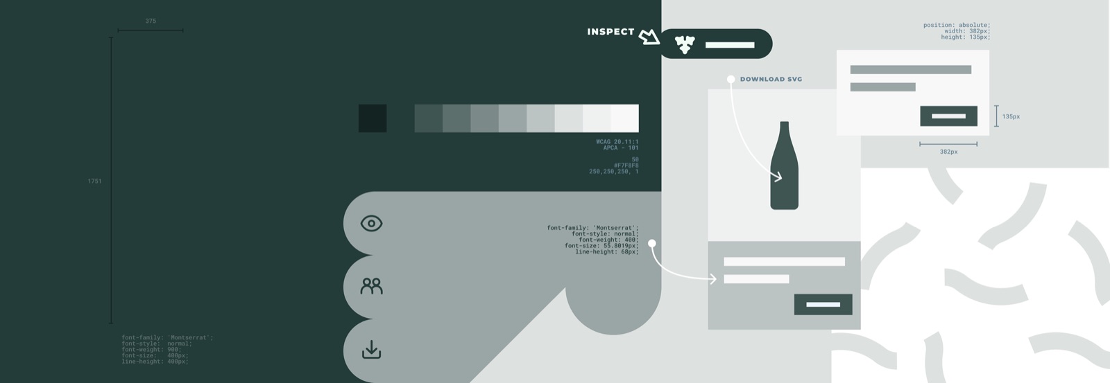
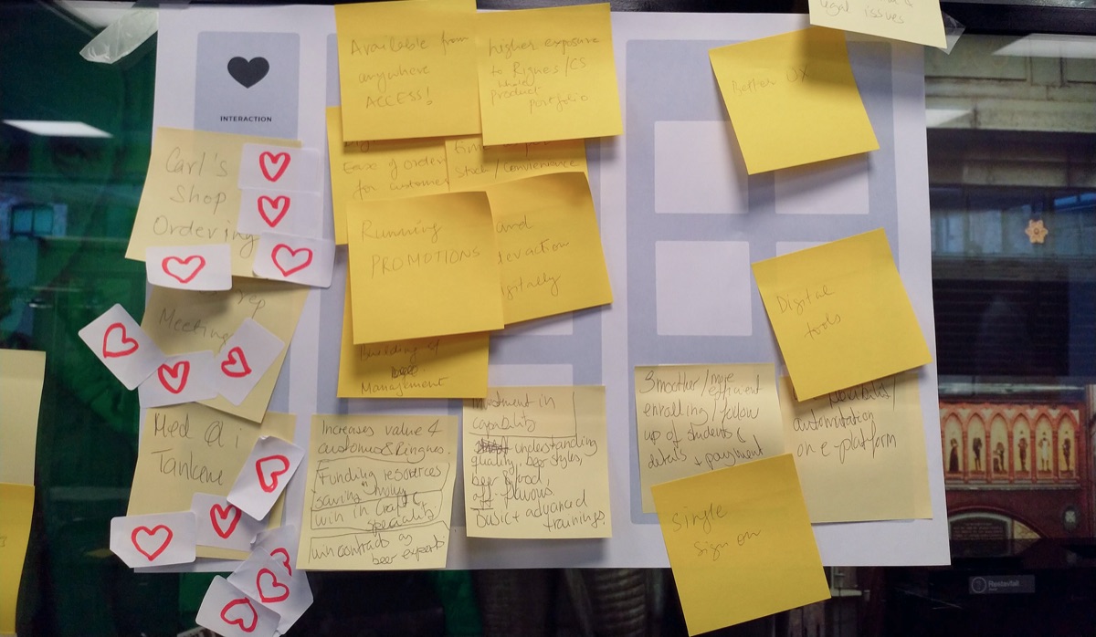
My job was to find the pain points and lift the experience. I started by auditing the global flows for quick wins, the low-hanging fruit that built trust with local stakeholders before the deeper work.
My initial phase involved an overview of the platform to identify "attrition areas." I proposed a series of small tweaks to the markets: these were "low-hanging fruit" that improved the UX quickly while building trust with local stakeholders.
By sharing wireframes and UI transformations early, I ensured the markets felt like partners in the creation of their own platform.
Once the most obvious usability hurdles were cleared, we moved into deep user research.
From friction to flow: the UX strategy
Instead of just improving and scaling the existing app, we focused on identifying the barriers to digital adoption.
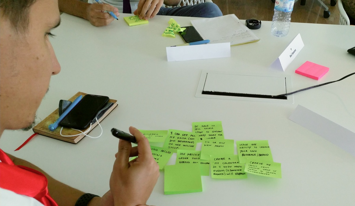
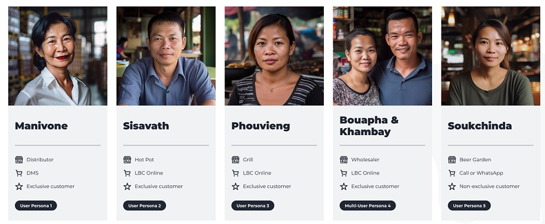
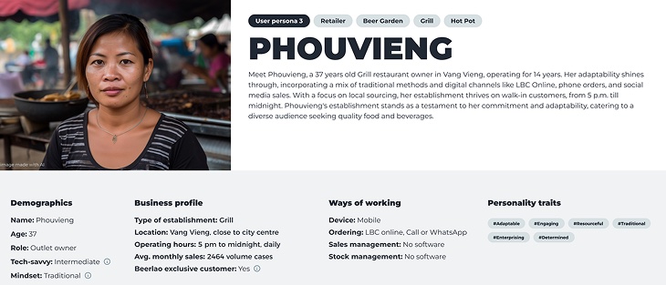
- The persona spectrum: through 32+ deep-dive interviews, we identified 6 distinct personas, ranging from "Tech-Savvy Owners" to "Analogue Veterans."
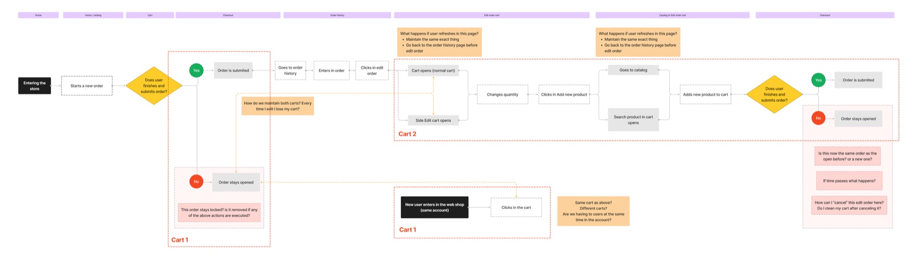
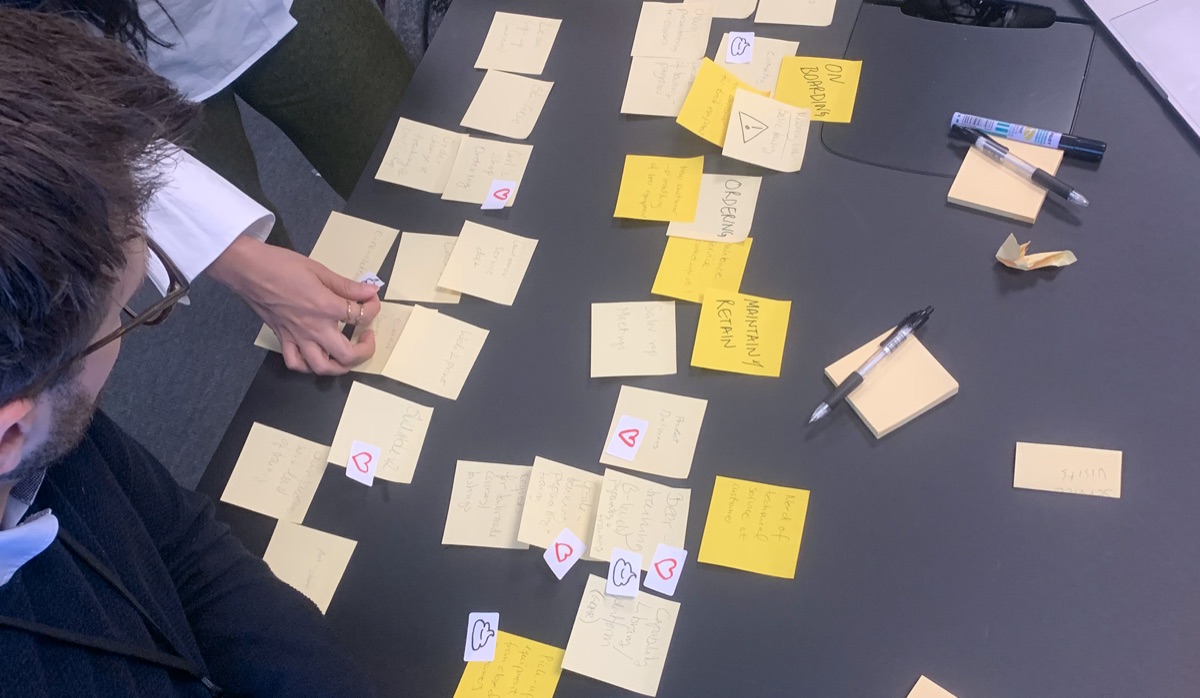
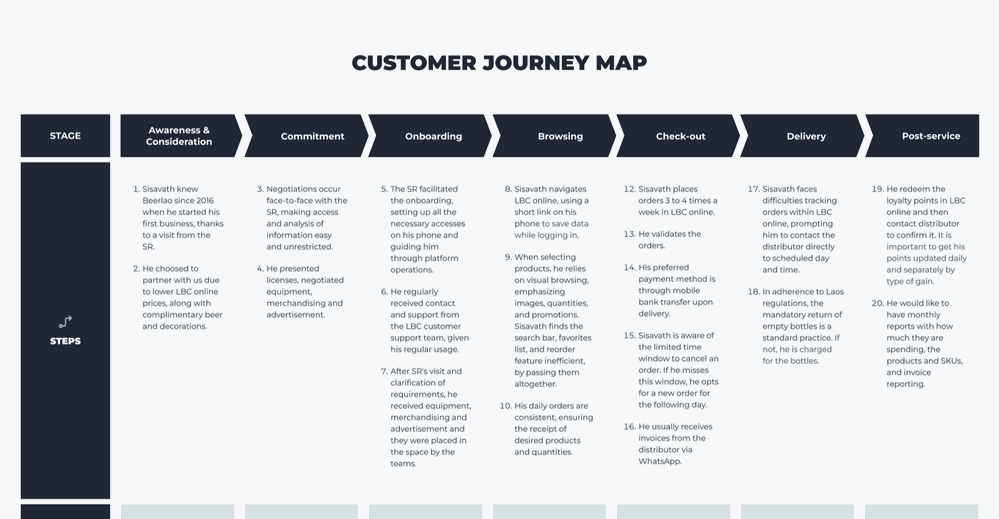
- Mapping the off-platform experience: my team led the creation of an end-to-end service blueprint. We didn't just look at the app; we looked at awareness, onboarding, delivery, and post-service.
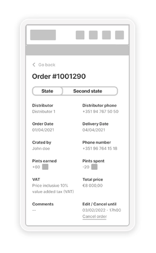
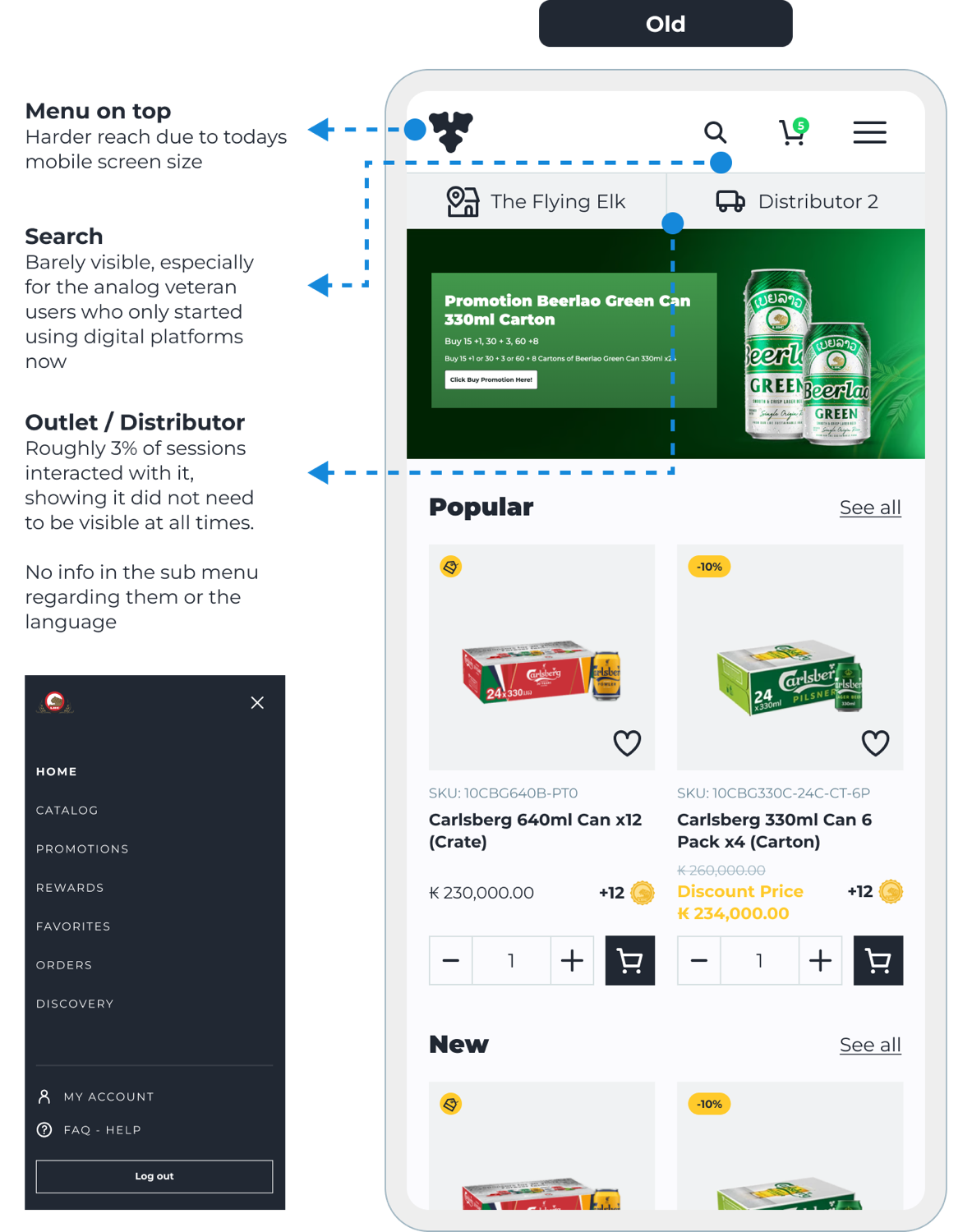
- Outcome: the mapping revealed that functions like "Login" held the primary friction points, causing drop-offs before users even saw the catalog. The same was true of the menu and of "Search," which led to the highest impact but very low reach.
High-impact solutions
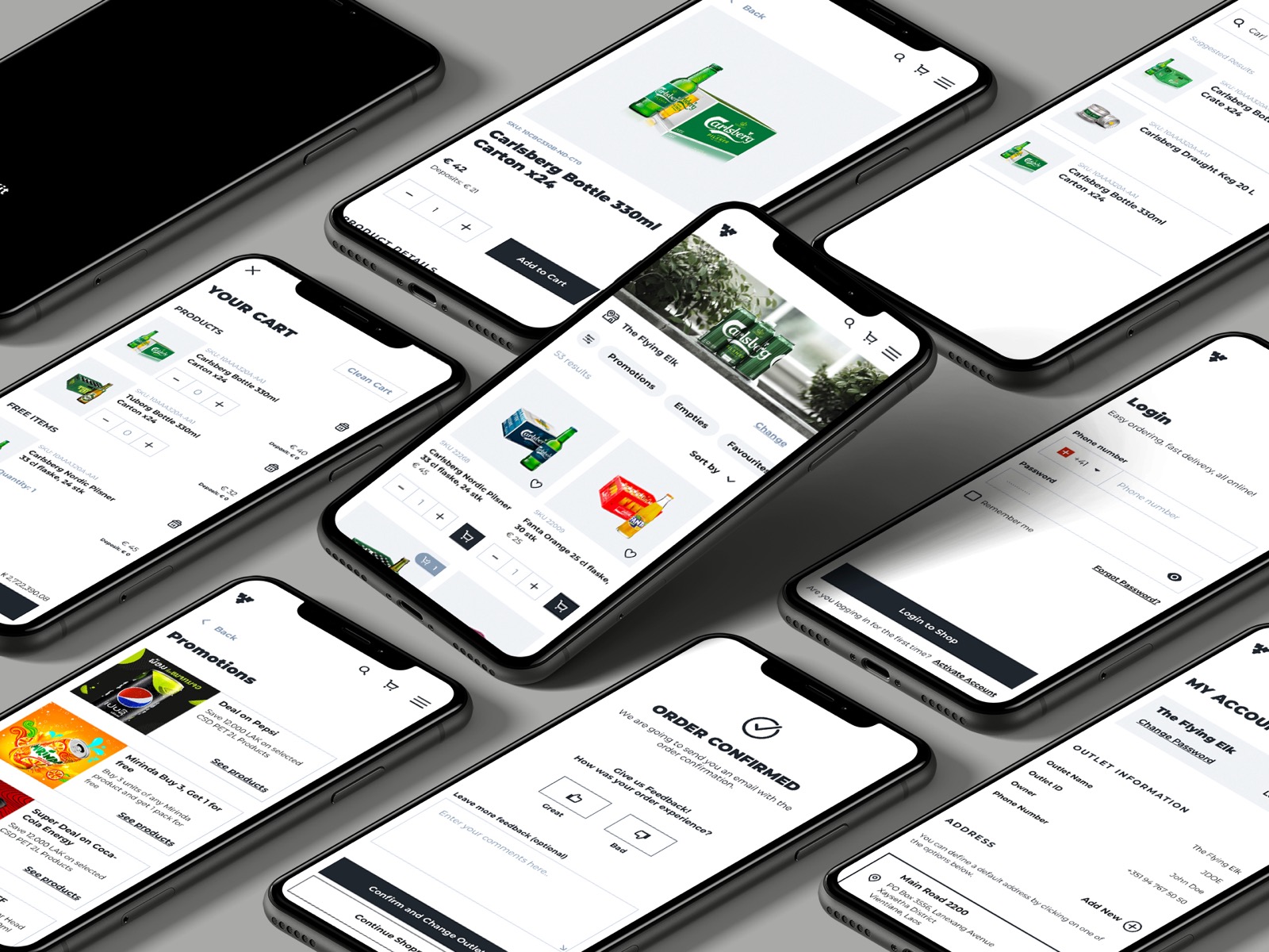
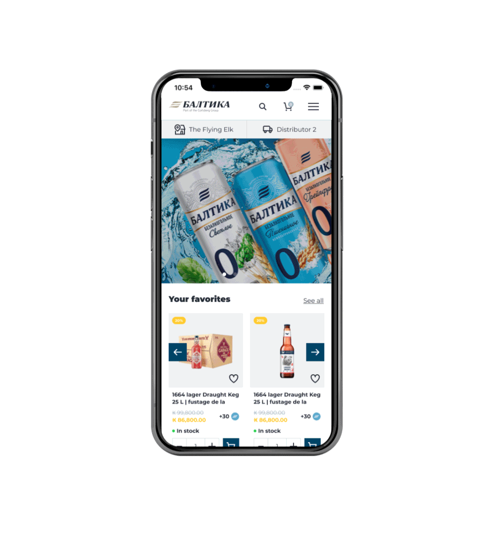
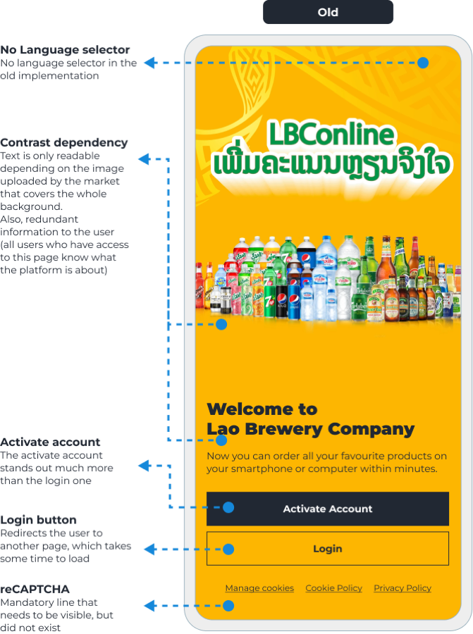
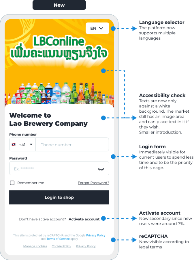
1. Simplifying the entry point (the new login)
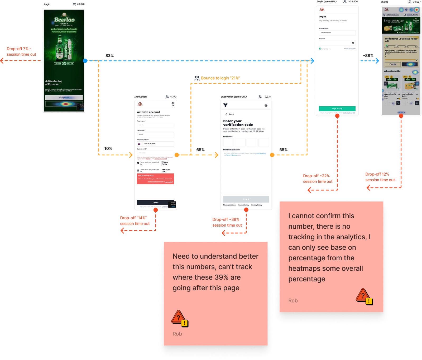
The insight: bounce was high on the activation/login screen. Existing users kept hitting "Activate account" instead of "Login", the hierarchy favored new users over returning ones. The task: cut friction for existing users without hurting activations.
The solution: simplify the login process, improve accessibility, and give login priority over activation.
2. The "3-stage" loading strategy
The challenge: due to high-latency API calls and inconsistent mobile network speeds in rural Asian markets, the platform suffered load times of up to 8 seconds. This latency led to high bounce rates and "system-failure" perceptions from users.
The solution: I collaborated with engineering to implement a progressive loading architecture. Instead of a blocking full-page loader, we engineered a three-tier entry sequence:
- Skeleton screens: immediate visual feedback to signal "system life" and reduce perceived wait time.
- Text-first content injection: prioritizing core data (pricing and stock status) with low-resolution image placeholders, so users could start their tasks instantly.
- Lazy-loading assets: finalizing high-resolution imagery in the background, only once the functional layers were interactive.
The result: we reduced time-to-interactive by 6 seconds and significantly lowered bounce rates within the product catalog, ensuring a smooth experience even in low-connectivity environments. It also increased overall engagement by 6%.
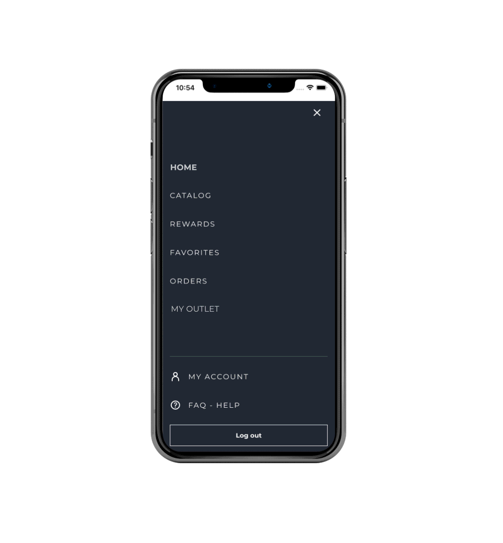
3. The menu and search problem (10% reach vs 70% conversion)
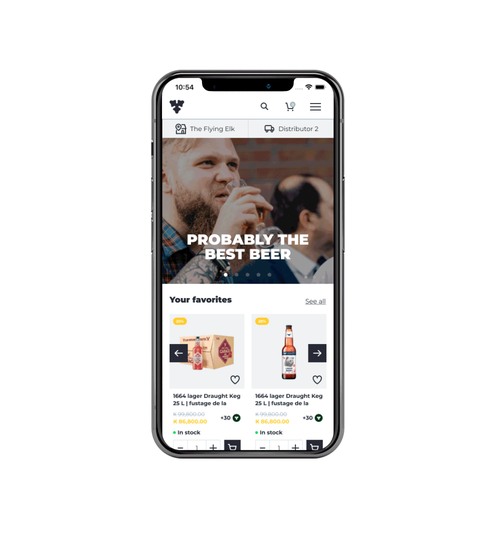
The insight: GA4 and Hotjar showed a striking pattern. Only 10% used search, but around 70% of them placed an order, the highest conversion on the platform. In interviews, some users didn't even know search existed, an accessibility gap. Same with the menu: only ~13% used it, most reached the catalog through homepage links on mobile.

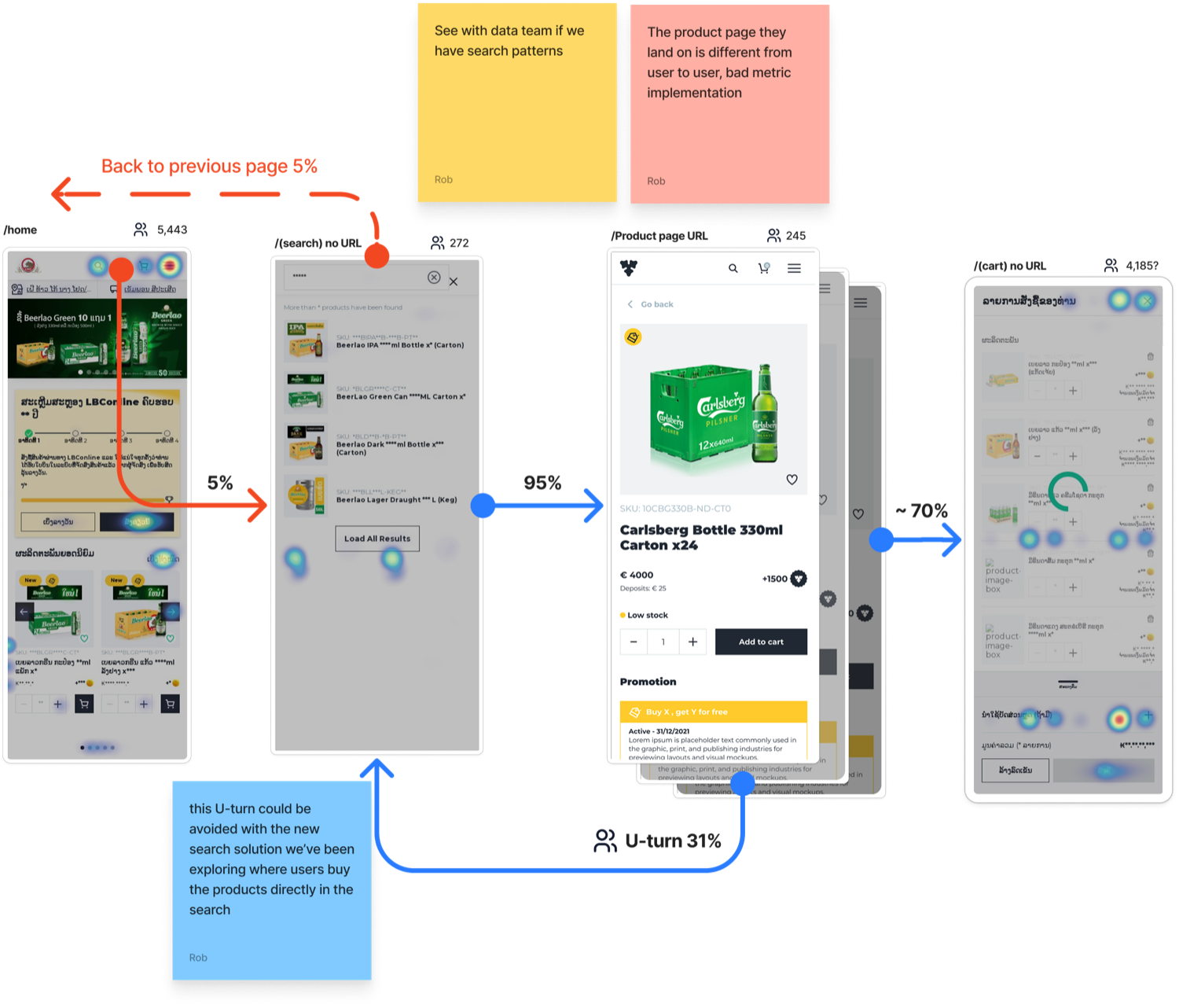
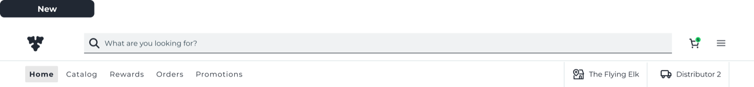
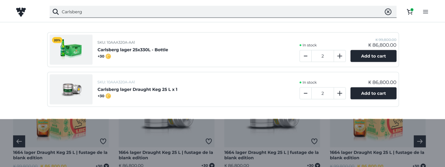
The solution: I led a complete overhaul of the menu and search experience. For search, instead of a standalone icon, I made it big, especially on desktop, and kept it always visible as an open form, introducing predictive typing, brand-based filtering, and visual suggestions. For the menu, the biggest change came on mobile, where users now had single-click access to our most-engaged pages.
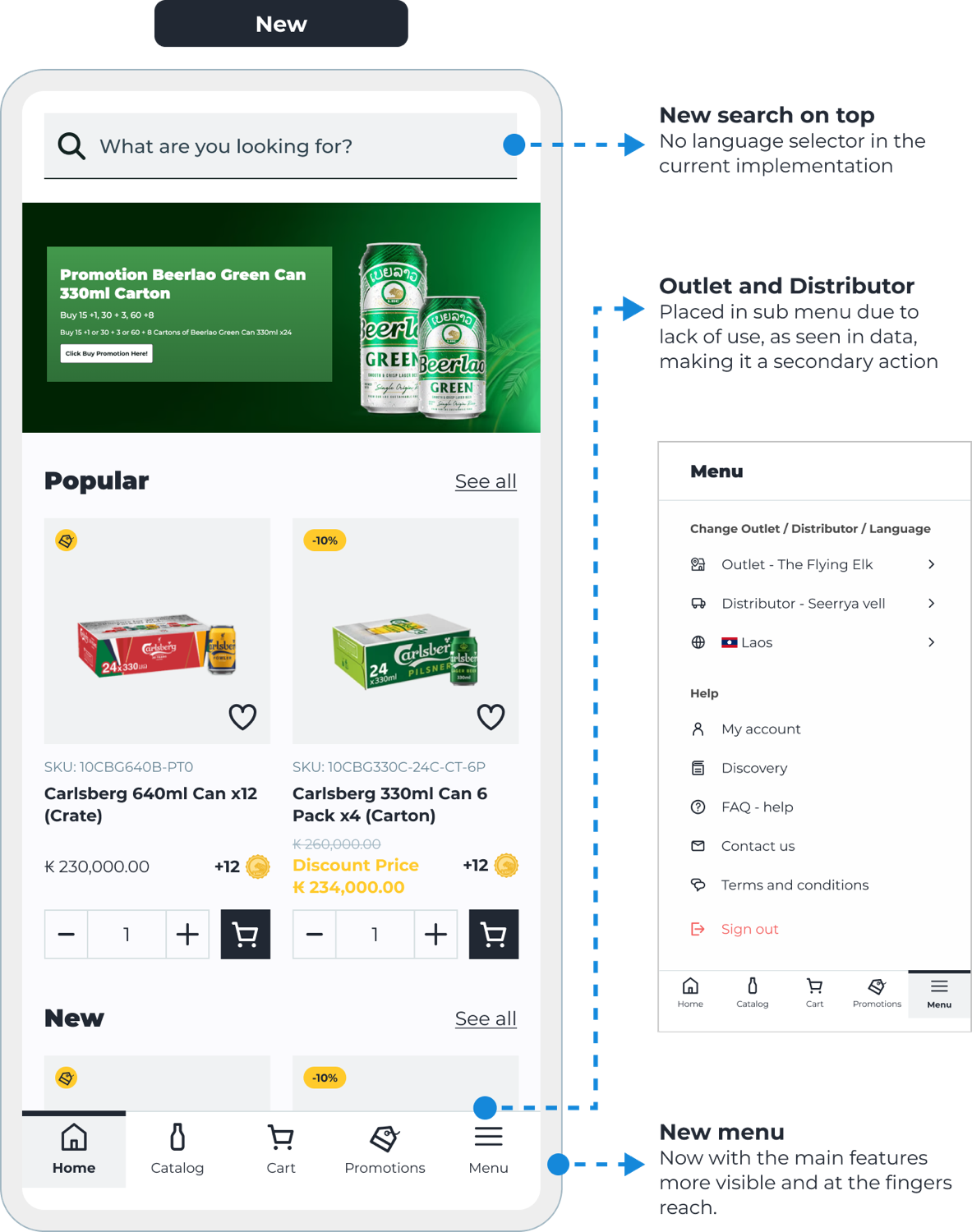
The result: search engagement increased 42%, directly correlating to a higher average order value, and menu use rose to over 60%, a fantastic result.
Using data as a compass
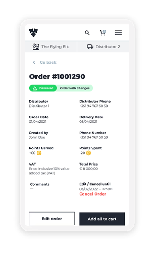
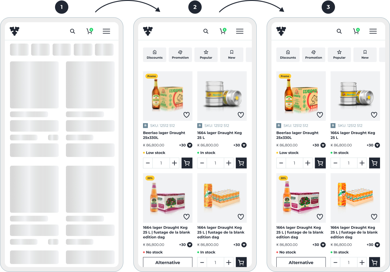
Once the platform stabilized, I shifted from building to optimizing. Hotjar recordings surfaced "rage clicks", most on the product cards. People bounced in and out of product details, or tapped the quantity field instead of the add button. So I rebuilt the cards for accessibility and responsive scaling: readable prices and stock on any device, no misclicks.
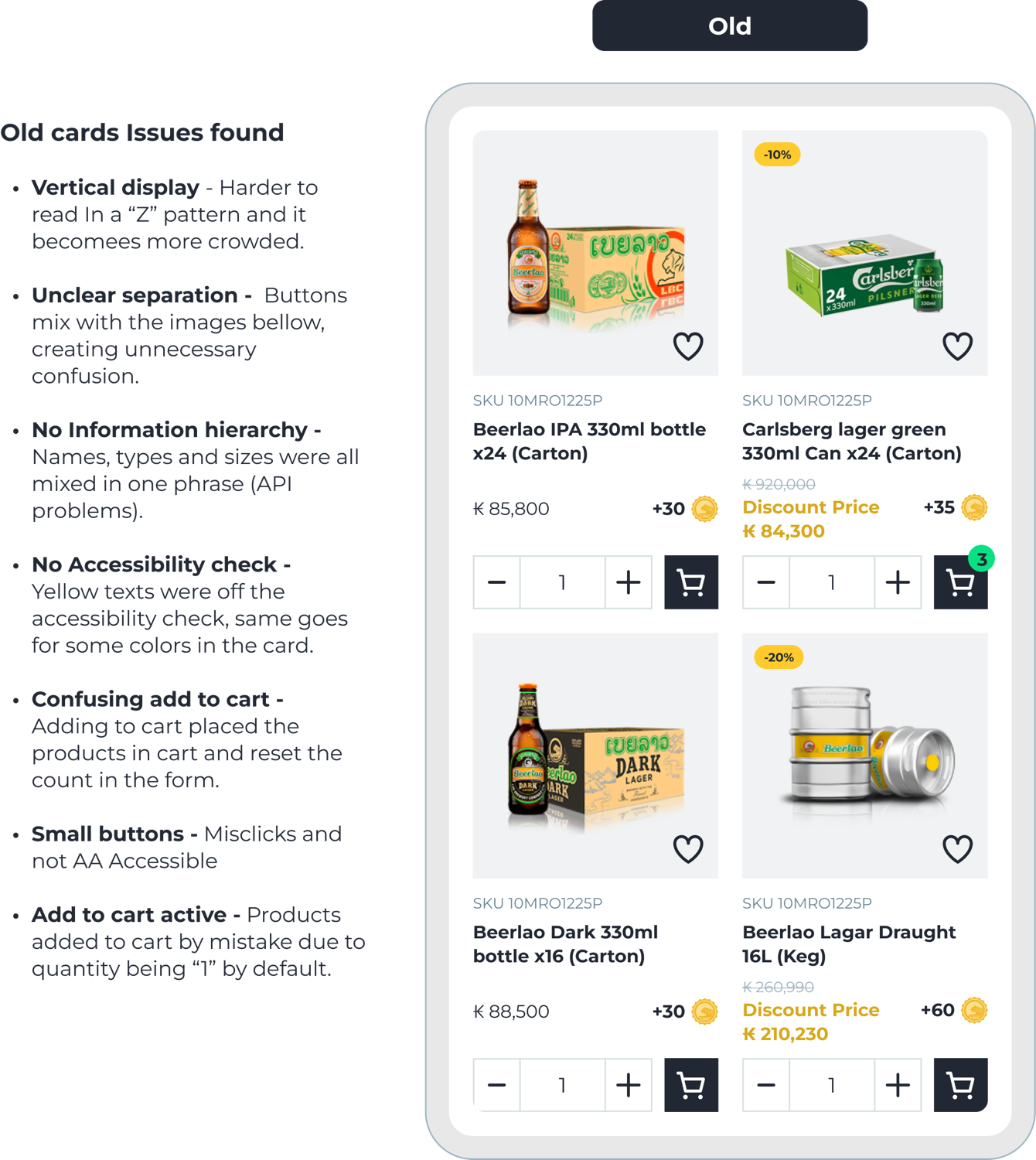
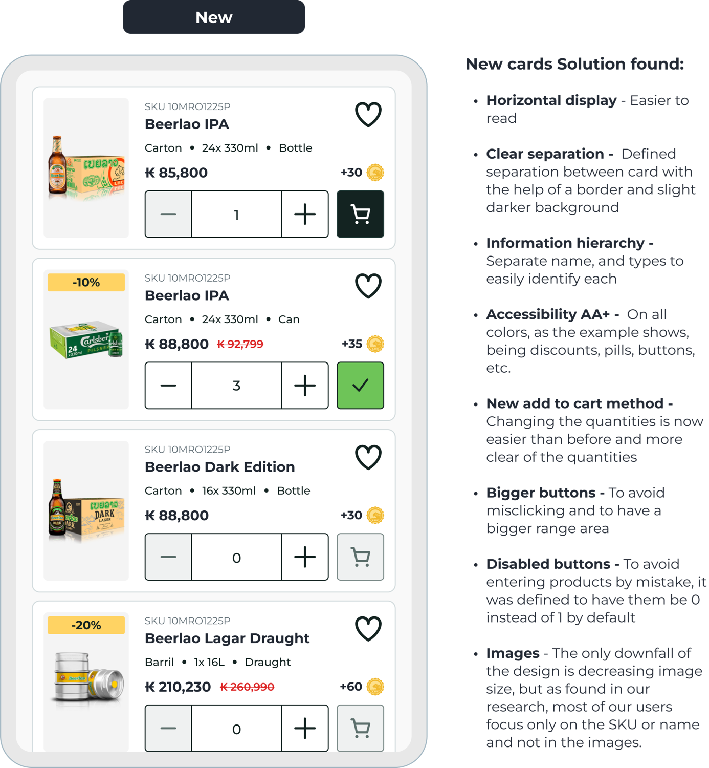
The redesign fixed all of it: a horizontal layout that reads faster, clear separation, real hierarchy, AA+ colors, a clearer add-to-cart, inline removal, and bigger targets defaulting to zero so nothing is added by mistake.
How I used AI on this project
Carlshop Plus spans dozens of markets, each with its own data, language, and quirks. AI let me move through that complexity faster, without giving up the design judgment that actually matters. Here's the honest split.
What I sped up with AI
Synthesizing 32+ interviews into persona drafts, generating layout variations for the search and card redesigns, and routing meeting transcripts straight into tickets so an agent could draft first wireframes. Figma's on-canvas agents and first-draft tooling, wired through MCP, handle the repetitive 60% of setup in the background.
What I did by hand
The information architecture, the trust calls on the "black box" loading and search behavior, and the accessibility hierarchy: the decisions that needed taste and context.
The result
More iterations in less time, and more of my hours on the high-impact calls instead of setup. Every session is tracked, so the next opportunity area surfaces itself.